Logo Design - Butler Dearden
The Ask: To create a logo that captured both the timeless elegance of a long-standing paper product business and a modern day flair.
My Solution: The concept I came up with was folded paper. I created a logo graphic based on how folded notepad paper would look. The shapes of the folded paper create the letters BD for the company’s initials.
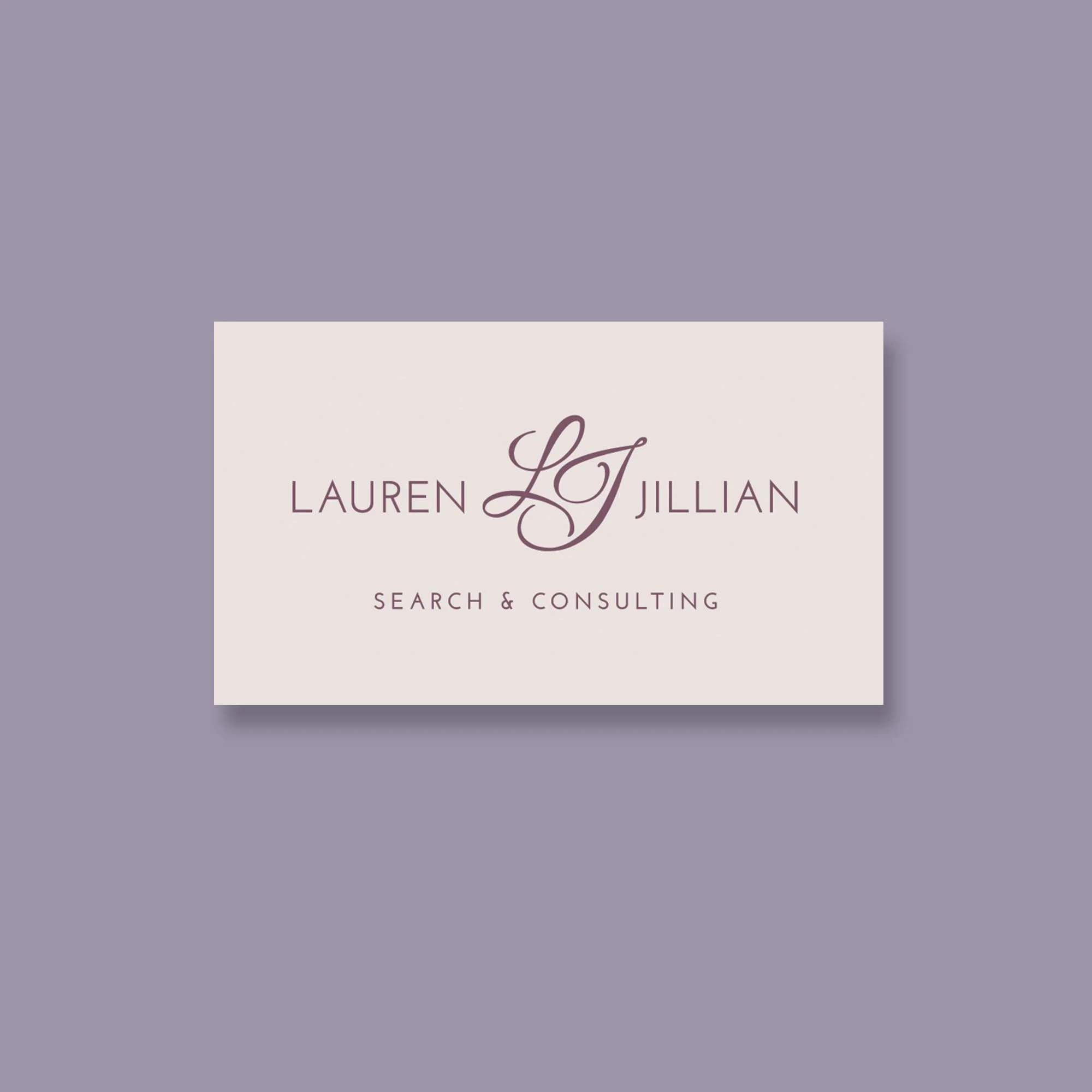
The Ask: To design a logo for an upscale staffing company with a feminine feel.
My solution: I first chose the color palette—soft shades of light peach, pink, mauve, pale purple, and cream. I chose a sans serif font for a modern, upscale feeling and paired it with a script logo mark of interlocking initials.
Logo Design - Lauren Jillian
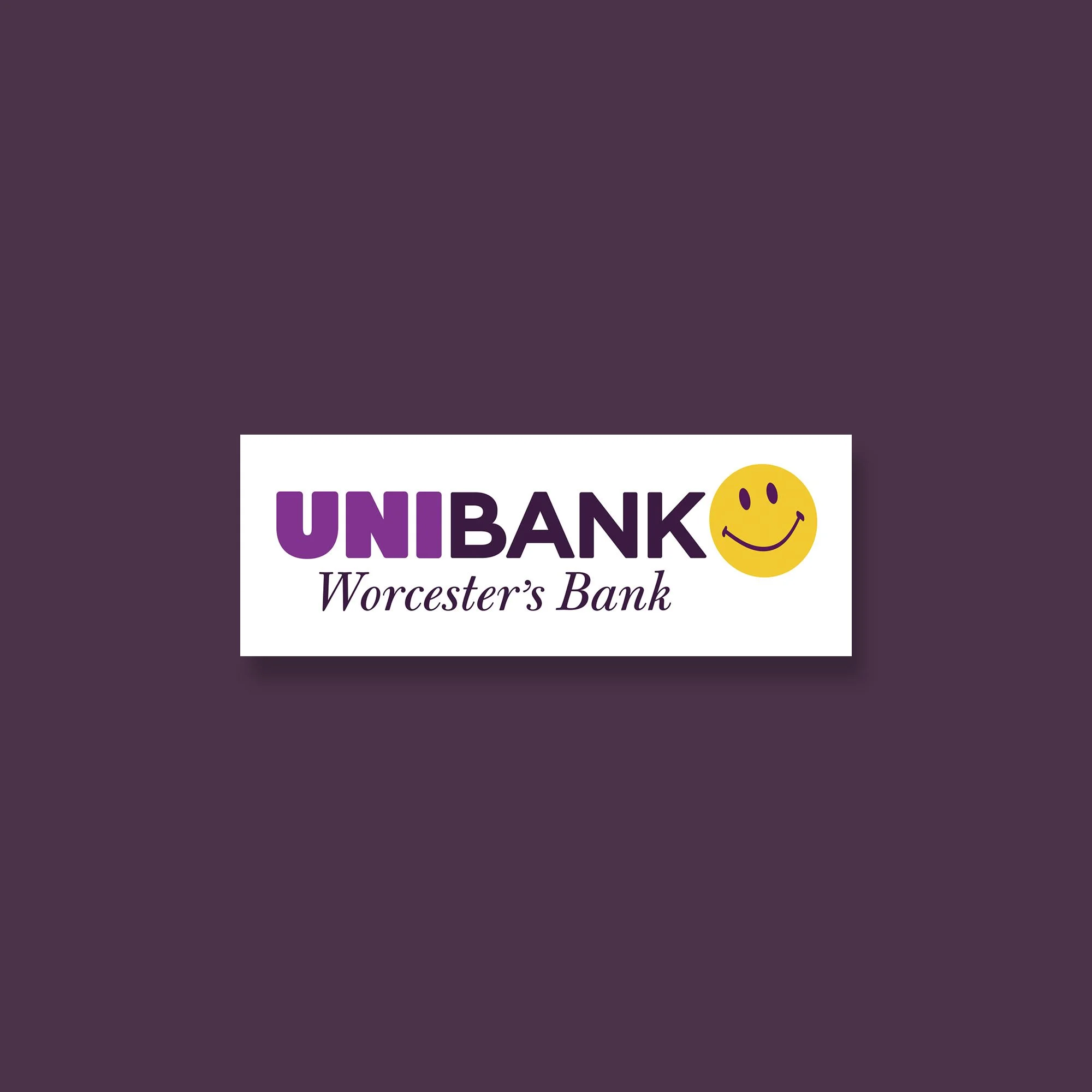
The Ask: To modify the bank’s existing logo to include a Worcester theme for the opening of their newest branch inside Polar Park.
My solution: I incorporated a smiley face that I designed based on the original smiley face invented in Worcester and added a tagline in a friendly, modern font.

